Monday 23 December 2013

Realised it had been a bit of a while


This is one of the resulting exhibitions stemming from my work into the exploration of what colour is, its primary and secondary qualitatives alongside its cultural and societal backgrounds, culminating in a witnessed phenomena of colour within the viewer.
Just a bit of documentation of some of my work, I think it illustrates some of what I am doing, while still keeping an aesthetic beauty, so I thought I should include it.

Ultramarine purple. A pigment which seems to encompass that of two of the most royal colours to ever gross the artist palette and I think it holds its own beauty while illustrating just how lucrative colour language really is.
This image was a part of one of my recent exhibitions at the university, illustrating the beauty of raw pigments which has inspired so many famous artists through the year, including Yves Klein, who once said "what luster, what ancient brilliance" in response to seeing the raw elements of paint, going on to show his dismay in how this beauty is lost in the mediums of his day, an idea perpetuated by Anish Kapor.
My blue room, an exhibition displaying the phenomena and subversiveness of colour, while attempting to illustrate some of the theories of contrast and harmony laid out by some of the greatest colour theorists and scientists of time, such as; Michel Eugène Chevreul, Ogden Rood, James Clerk Maxwell and George Field. The next four images display some of the elements of this instalation
This final image displays some of the strangest, most valuable and toxic paints we have ever used. Having created these paints from their raw pigments provided a lot of fun, although incredibly dangerous and should not be tried at home without the correct precautions. From left to right the paints are made from; a derivative of cynaide, lapis lazuli, ultramarine, cobalt and mercury sulphide. The green, yellow and red have all claimed many many lives in their lifetime, yet I think they hold some of the most beautiful colour paint I have ever come across, I am not sure if this picture really does them justice.

Wednesday 30 October 2013

Advancing


 Chemical formation 945 - Carrying on with my ferrofluid sculptures I decided to create a mixture of colours within singular lakes of one another. I found it to create a movement and feeling within its area. I feel it tells a story in itself of horror and hope, dominated by the upper class of Purple royalty.

 This image was created during my experiments with conjuring colour. I have been going through the motions of creating my own paints, choosing to start with ultramarine due to its transcendent nature. Although this pigment is the synthetic modern day pigment. As the oil was laid across it, I noticed its inspired similarities to the original pigment, Lapis Lazuli and went about documenting this image.


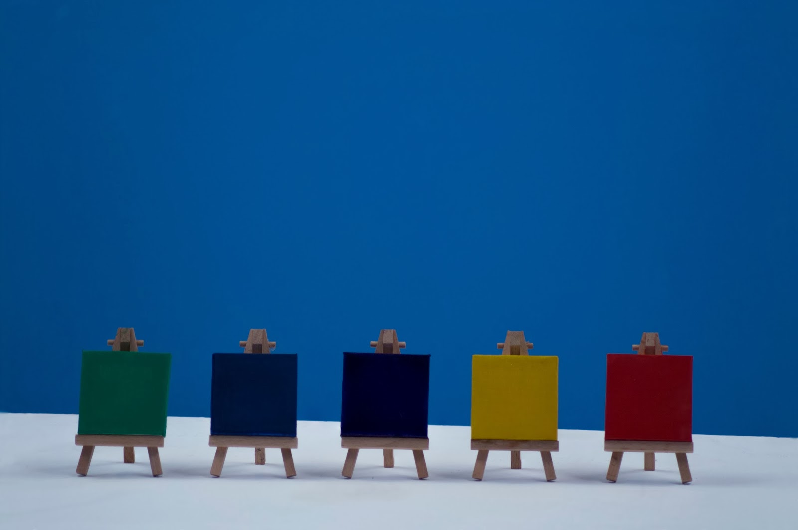
 This is the documentation of the current progression in my exploration of colour chemistry as a response to my dissertation research. This series will eventually be moved into an exhibition room to create an installation based on the chemistry of colour, to hopefully get people to think about and understand their materials more in depth.


 All of the colours within these works have been created by paint I have made myself in the studio, there is currently a royal purple and a white canvas drying to complete the series. Each colour will have its own in depth description below it in the final installation sharing my knowledge of its historical and scientific backgrounds.


Wednesday 2 October 2013

Back into the studio at last


Back to uni heralds the new possibilities of open plan exhibition rooms to be taken over by crazed art students, I commandeered one for its lighting and have kick started the daunting third year ceremonies with images such as these.

Wednesday 7 August 2013

I'm Back

So it has been a while since I last managed to update the page due to exhibitions and working in London with artists Hilary Koob-Sassen and Tim Flach ( http://hilarykoobsassen.com/ and http://www.timflach.com/ ). However I am now back to making my own work again and here is a taster of whats coming.

"Orchid" is my latest works using image stacking and focus rails to create a finer crisper image on a larger scale. The reason I am working with an Orchid rather than my usual ferrofluid formations is due to the fact I am currently staying in Cheltenham with my girlfriend and Orchids have a deep root within our relationship. It is said the Orchid is a symbol of delicate rarity with this ones white flowers giving an enhanced feeling of purity and against the warm pink background the plant reveals a feeling of elegance and exoticism.

Friday 24 May 2013

End of year exhibition

Beyond Colouring-in is the Swansea Metropolitan university's end of year show, consisting of primarily 2nd years the show will take place at 7 p.m on the 7th of June.

We do have a website; http://smufineartexhibition.weebly.com/ check everyone out, there's some real talent developing in the Swansea Met and we are hoping to show you some!

So, "COME ONE COME ALL, STEP RIGHT UP! For one week only there are spectacles I can guarantee you have never seen before!" Get everyone to come along and it'll be an event to remember!


Wednesday 24 April 2013

Bubble


The series "bubble" comes from my previous exhibition in which I invited people to explore the artistic medium of ferrofluid, showing them my processes and seeing if they can create similar works within the space. This particular offshoot of the exhibition came when a fluid formation was overloaded with thin water colour and ink, it was then knocked slightly so that the waters escaped the formation. After being left for a few hours I then began to play with the new liquid that had been left sliding away from the form, it had taken on a thickened form and was therefore easier to manipulate into creating the droplet formations we see.